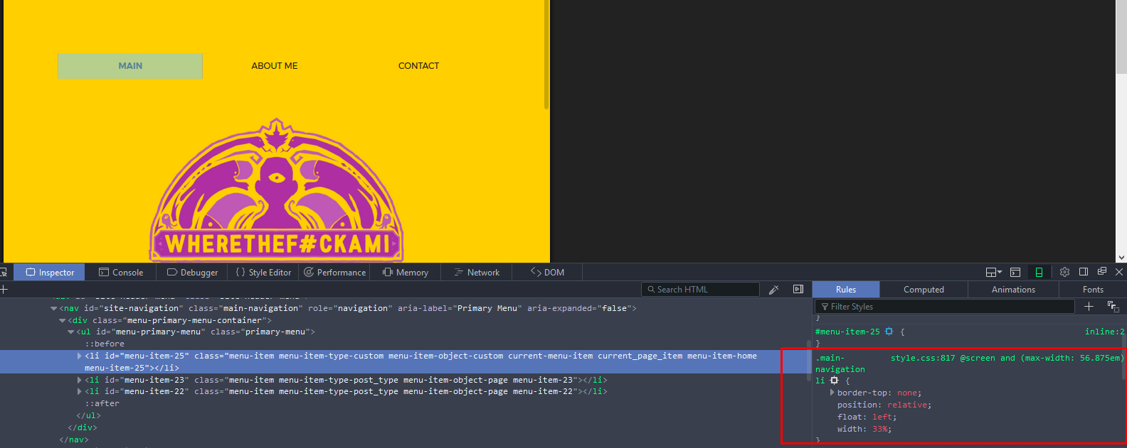
Add below css in your theme style.css file, change font size if you need
@media screen and (max-width: 56.875em) {
    .main-navigation li {
        float: left;
        width: 33.333333%;
        text-align: center;
        font-size: 12px;
    }
}
UPDATE:
To make menu items inline apply floats on list elements not on nav tag
I checked using inspect elements and code i sent works fine. check that rule does not override by any other CSS in hierarchy.
Related Posts:
- How to get IDs for objects in menu branch?
- Show only 2nd level of navigation depending on active navigation
- Remove navigation from header in custom page template
- How to retrieve depth of menu into template
- Output menu navigation in php file
- Change submenu markup
- How to modify wp-includes without messing my wordpress installation?
- WordPress template – How to add class to li tag if submenu exist
- How can I switch pages?
- How can template identify what page it’s being used on?
- Add a submenu to wp_nav_menu
- Automatically going to the first page in a hierarchy?
- How to add search to menu?
- Is it all right to put the whole tag into template_part file?
- Create link/button to create new post using specific template
- wp_nav_menu doesn’t show on index page
- Setting up menus before making a template live
- Display a portion/ branch of the menu tree using wp_nav_menu()
- Programmatically add a Navigation menu and menu items
- Any docs for wp_nav_menu’s “items_wrap” argument?
- Customizing Only a Specific Menu using the “wp_nav_menu_items” Hook?
- Changing the Order of Admin Menu Sections?
- How make top level menu item not have link, but have sub-menus that are linked?
- Add ‘has_children’ class to parent li when modifying Walker_Nav_Menu
- Get WP Navigation Menu from REST API V2
- How to Hard Code Custom menu items
- How to add a Custom Link to a Menu with a URL that is relative to the blog URL
- How do I remove UL on wp_nav_menu?
- Retrieving a list of menu items in an array
- WordPress default menu in database
- Adding an Arbitrary Link to the Admin Menu?
- Dynamically exclude menu items from wp_nav_menu
- Add “Logout” link to navigation menu
- Error: Declaration of MyClass::start_lvl() should be compatible with that of Walker_Nav_Menu::start_lvl()
- Split up wp_nav_menu with custom walker
- Removing container from wp_nav_menu not working
- Custom Nav walker display current menu item children, or siblings on no children
- wp_nav_menu: show menu only if one exists, otherwise show nothing
- Is there an easy way to replace a custom menu link with a page or post?
- Convert output of nav_menu items into a tree-like multidimensional array
- Get page IDs from nav items
- Add a custom walker to a menu created in a widget
- Using a menu walker add a custom item at the end of the menu’s items
- Add settings to menu items in the Customizer
- wp_get_nav_menu_items() not working with slug
- How to get current-menu-item title as variable?
- Error “Trying to get property of non-object” with Custom Walker for wp_nav_menu
- Add Class to Specific Link in Custom Menu
- Remove a menu item in menu
- Generate a Menu that Displays Child Pages using wp_list_pages() with the New Menu Functionality in WordPress 3.0?
- How do I get the name of a menu in WordPress?
- How to Add to Each Menu Link with link text to data-attr?
- How to manually specify the current active page with wp_nav_menu()
- How to count nav menu items?
- How Does The Walker Class Work?
- Add Javascript to WordPress Menu
- Add custom menu item using wp_nav_menu_items filter
- Filter wp_nav_menu()
- How to modify navigation menu of the “My Account” page in WooCommerce
- remove “edit your profile” from admin menu bar
- WordPress Settings API, Implementing Tabs On Custom Menu Page
- Adding line breaks to nav menu items
- Adding category ID or slug to WP Nav Menu
- add custom class to wp_nav_menu using filter hook nav_menu_css_class
- Custom ID for certain menu item?
- Does Extending Multiple Nav_Menu_Walkers Allow Nested Menus?
- Check if page is in a certain menu
- how to create a menu with all sub categories?
- Making breadcrumb with wp_nav_menu
- Does WP REST API have a built in route for calling menu?
- How to avoid wp_nav_menu() ID conflict?
- Add data-icon input to WordPress custom menu links
- Registering menu with ‘Automatically add new top-level pages to this menu’ selected
- Why do Custom Nav Menus generate so many classes on list items? Can I manage this somehow?
- wp_nav_menu remove class and id from li
- Custom search filter causes menu and query_posts problems
- Unregister Nav Menu from Child-Theme
- How does a minimal menu walker look like?
- Add separator to admin submenu
- fall back for main menu?
- On which hook should I be calling register_nav_menu(s)?
- WordPress Shortcode in Menu Item Title
- register_nav_menus() won’t register menus
- Calling the Menu Title within wp_nav_menu array function
- How can I create an auto-populated menu that is automatically assigned to a location?
- Display only page specific sub menu items using Custom Walker
- How do I add a search box to the nav menu?
- New post notification in wp_nav_menu
- Custom Post Types posts as submenus in Nav Menu
- Link to Author archive from Navigation Menus in dashboard?
- How to stop mobile theme inheriting desktop navigation menu?
- Add child pages automatically to nav menu
- adding some custom html code to the wp_nav_menu function
- WordPress Menu Custom Walker Class
- Show just one level of child pages, wp_list_pages woe
- Increase search results for Admin -> Appearance -> Menus -> Search (default is 10)
- How to create this custom menu walker?
- Removing link ” from ” menu for some “links” without JS
- How to change order of menu items
- Renaming a WordPress Admin Menu