i’m using wp-list-table without the (php) class but html only and wanna share my research. There is some stuff to watch if you need a responsive table when building a wp-list-table yourself:
- add class
column-primaryto headerthand bodytd. If this class is missing the table gets messy in mobile view - add button with
toggle-rowclass intocolumn-primaryto expand the row - add
data-colnameto bodytd– content in mobile get displayed in the middle. Withoutdata-colnamethe label is missing (which normally displayed in the table header)
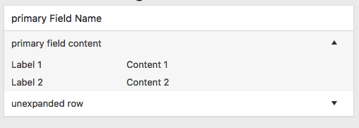
Final HTML Code should look like this:
<table class="wp-list-table widefat striped">
    <thead>
    <tr>
        <th class="column-primary">primary Field Name</th>
        <th>Label 2</th>
        <th>Label 3</th>
    </tr>
    </thead>
    <tbody>
    <tr class="is-expanded">
        <td class="column-primary" data-colname="Name">primary field content
            <button type="button" class="toggle-row">
                <span class="screen-reader-text">show details</span>
            </button>
        </td>
        <td data-colname="Label 2">Content 2</td>
        <td data-colname="Label 3">Content 3</td>
    </tr>
    <tr>
        <td class="column-primary" data-colname="Name">unexpanded row
            <button type="button" class="toggle-row">
                <span class="screen-reader-text">show details</span>
            </button>
        </td>
        <td data-colname="Label 2">Content 2</td>
        <td data-colname="Label 3">Content 3</td>
    </tr>
    </tbody>
</table>