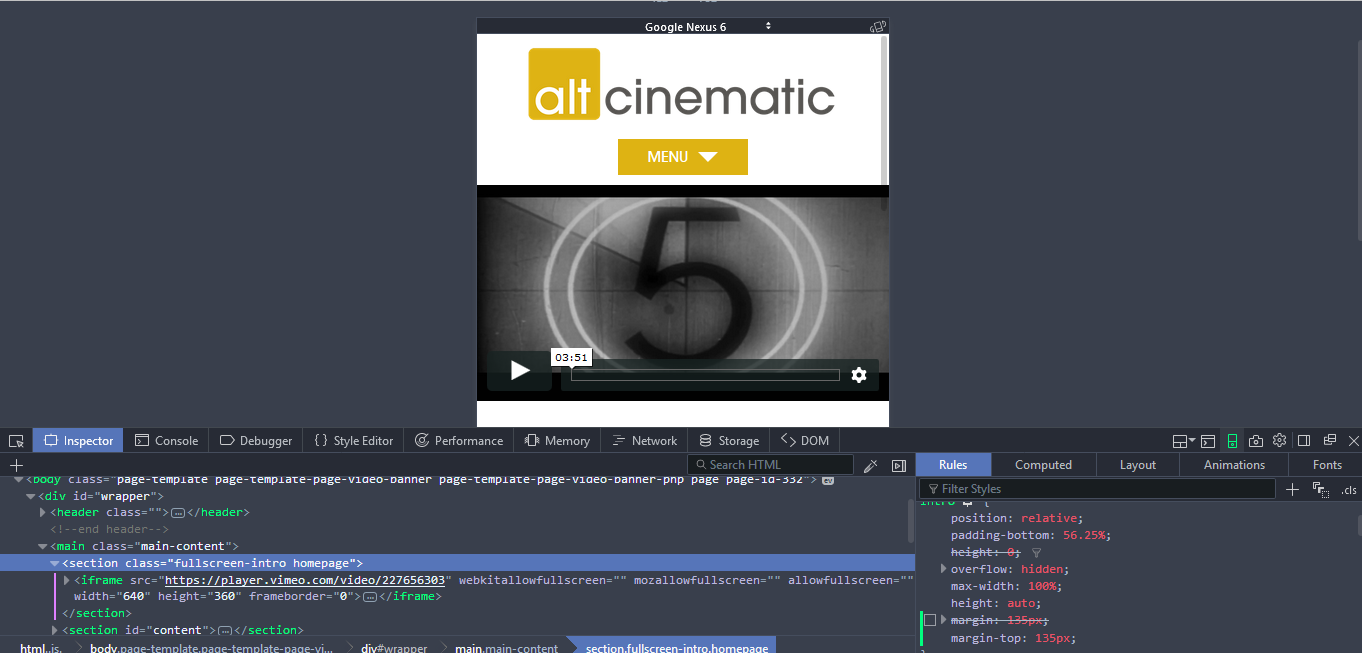
You can target those devices using css, and put a declaration specifically for that.
Add this to your css file, and adjust to the suitable value:
@media screen and (max-width: 768px) {
    .page-template-page-video-banner .fullscreen-intro {
        margin-top: 135px !important;
    }
}
Related Posts:
- How can I make the wordpress editor apply the selected template?
- CSS style button For WP Login Function in page template
- Edit css for search results page
- How to change the settings of a video? [closed]
- Problem alignment issue with echo knowledge base
- Style sidebar for a custom page template exclusively
- Text Not Wrapping Around Right Floated Image [closed]
- What’s the difference between SCSS and Sass?
- How am I supposed to use index.html?
- Column order manipulation using col-lg-push and col-lg-pull in Twitter Bootstrap 3
- What is the difference among col-lg-*, col-md-* and col-sm-* in Bootstrap?
- Adding border to SVG image
- What does !important mean in CSS?
- Set line spacing
- Remove blue underline from link
- CSS Background Opacity [duplicate]
- Outline effect to text
- Customize Bootstrap checkboxes
- Making a
- React.js inline style best practices [closed]
- What is a user agent stylesheet?
- What is a user agent stylesheet?
- Is there a CSS parent selector?
- CSS to make HTML page footer stay at bottom of the page with a minimum height, but not overlap the page
- Vertically align text within a div
- How to align a to the middle (horizontally/width) of the page [duplicate]
- Animate the overflow property
- Is there a color code for transparent in HTML?
- multiple classes on single element html
- CSS opacity only to background color, not the text on it?
- How do I center floated elements?
- create a white rgba / CSS3
- Using CSS for a fade-in effect on page load
- Gradient borders
- Superscript in CSS only?
- What is WebKit and how is it related to CSS?
- What’s the difference between display:inline-flex and display:flex?
- Making an iframe responsive
- How can I invert color using CSS?
- How to insert spaces/tabs in text using HTML/CSS
- font-family is inherit. How to find out the font-family in chrome developer pane?
- How to get these two divs side-by-side?
- How can I vertically center a “div” element for all browsers using CSS?
- What does auto do in margin: 0 auto?
- Does bootstrap have builtin padding and margin classes?
- How to change the color of an svg element?
- Changing spacing between paragraphs and inside of paragraphs
- Is there a color code for transparent in HTML?
- How to vertically align an image inside a div
- How can I center an absolutely positioned element in a div?
- Nesting CSS classes
- Applying Comic Sans Ms font style
- How to set up fixed width for
? - “Stray start tag footer” in html validator?
- How to change btn color in Bootstrap
- Make div scrollable
- Failed to decode downloaded font, OTS parsing error: invalid version tag + rails 4
- Chrome give error **Failed to load resource: net::ERR_NAME_NOT_RESOLVED** while other browser load images
- What is the difference between the selectors “.class.class” and “.class .class”?
- CSS: Creating textured backgrounds
- Insert image after each list item
- How to make the HTML link activated by clicking on the
- ?
- How to change text transparency in HTML/CSS?
- How do I hide the bullets on my list for the sidebar?
- limitations of using @Html.EditorForModel
- Transition of background-color
- How to implement max-font-size?
- How to float 3 divs side by side using CSS?
- How to override the properties of a CSS class using another CSS class
- HTML Width Percentage
- Circle button css
- force footer on bottom on pages with little content
- draw diagonal lines in div background with CSS
- How to add a color overlay to a background image?
- Change color of PNG image via CSS?
- css transition opacity fade background
- Better way to set distance between flexbox items
- Text-decoration: none not working
- How to set up fixed width for
? - How do I center an h1 in the body
- CSS3 Transition not working
- In CSS what is the difference between “.” and “#” when declaring a set of styles? [duplicate]
- How do I rotate text in css?
- CSS Invalid Property Value?
- right align an image using CSS HTML
- How can I transition height: 0; to height: auto; using CSS?
- css to make bootstrap navbar transparent
- how to offset a CSS border up and left
- @Media min-width & max-width
- CSS display: inline vs inline-block
- css: how to center box div element directly in center?
- How do I center this form in css?
- How to apply a CSS filter to a background image
- Aligning two divs side-by-side
- Play multiple CSS animations at the same time
- Dynamically change color to lighter or darker by percentage CSS
- How can I replace text with CSS?
- CSS text-align: center; is not centering things
- Why are my CSS3 media queries not working on mobile devices?
- Transitions on the CSS display property