If you have a LESS version of Bootstrap (non-compiled) you need to change the @grid-float-breakpoint variable to 992px to get the navbar to collapse on “Tablet” (Medium) breakpoint. Source:
Changing the collapsed mobile navbar breakpoint
The navbar collapses into its vertical mobile view when the viewport is narrower than @grid-float-breakpoint, and expands into its horizontal non-mobile view when the viewport is at least @grid-float-breakpoint in width. Adjust this variable in the Less source to control when the navbar collapses/expands. The default value is 768px (the smallest “small” or “tablet” screen).
If not, and you’ve only made a couple of changes to Bootstrap, it would be best to download it again via the customiser: http://getbootstrap.com/customize/
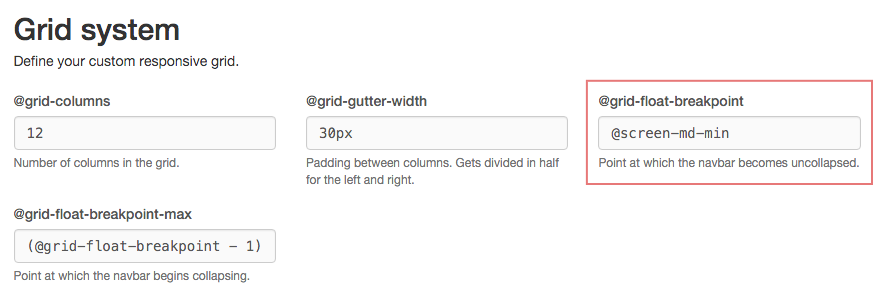
Visit the page, search for @grid-float-breakpoint (about half way down the page) and change the value to @screen-md-min (see screenshot). This should then fix the problem for you.
If you’d rather not recompile Bootstrap the only other way would be create an overriding media query and copy all navbar references under the original media query (768px) into it. This isn’t the ideal solution however to ensure that you get everything it would be worth looking for the bootstrap/less/navbar.less file on github (https://github.com/twbs/bootstrap/blob/master/less/navbar.less) Find any instance of @media (min-width: @grid-float-breakpoint) { ... } and that’s the code you need to replace.
@media (min-width: 992px) {
    //All min-width: 768px navbar code
}