(UPDATED with examples for Bootstrap v4, v3 and v3)
Examples of forms with validation classes for the past few major versions of Bootstrap.
Bootstrap v4
See the live version on codepen
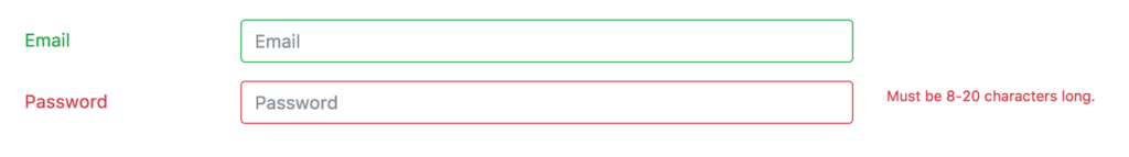
<div class="container">
  <form>
    <div class="form-group row">
      <label for="inputEmail" class="col-sm-2 col-form-label text-success">Email</label>
      <div class="col-sm-7">
        <input type="email" class="form-control is-valid" id="inputEmail" placeholder="Email">
      </div>
    </div>

    <div class="form-group row">
      <label for="inputPassword" class="col-sm-2 col-form-label text-danger">Password</label>
      <div class="col-sm-7">
        <input type="password" class="form-control is-invalid" id="inputPassword" placeholder="Password">
      </div>
      <div class="col-sm-3">
        <small id="passwordHelp" class="text-danger">
          Must be 8-20 characters long.
        </small>
      </div>
    </div>
  </form>
</div>
Bootstrap v3
See the live version on codepen
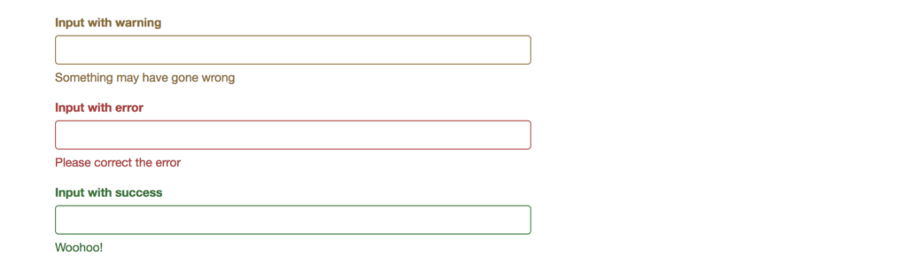
<form role="form">
  <div class="form-group has-warning">
    <label class="control-label" for="inputWarning">Input with warning</label>
    <input type="text" class="form-control" id="inputWarning">
    <span class="help-block">Something may have gone wrong</span>
  </div>
  <div class="form-group has-error">
    <label class="control-label" for="inputError">Input with error</label>
    <input type="text" class="form-control" id="inputError">
    <span class="help-block">Please correct the error</span>
  </div>
  <div class="form-group has-info">
    <label class="control-label" for="inputError">Input with info</label>
    <input type="text" class="form-control" id="inputError">
    <span class="help-block">Username is taken</span>
  </div>
  <div class="form-group has-success">
    <label class="control-label" for="inputSuccess">Input with success</label>
    <input type="text" class="form-control" id="inputSuccess" />
    <span class="help-block">Woohoo!</span>
  </div>
</form>
Bootstrap v2
See the live version on jsfiddle
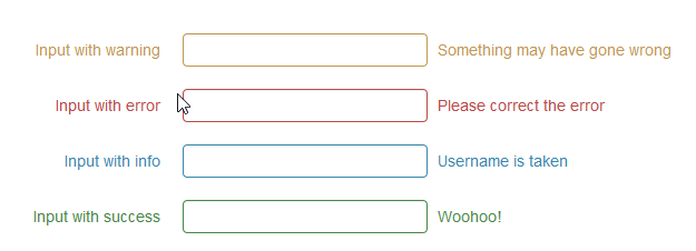
The .error, .success, .warning and .info classes are appended to the .control-group. This is standard Bootstrap markup and styling in v2. Just follow that and you’re in good shape. Of course you can go beyond with your own styles to add a popup or “inline flash” if you prefer, but if you follow Bootstrap convention and hang those validation classes on the .control-group it will stay consistent and easy to manage (at least since you’ll continue to have the benefit of Bootstrap docs and examples)
  <form class="form-horizontal">
    <div class="control-group warning">
      <label class="control-label" for="inputWarning">Input with warning</label>
      <div class="controls">
        <input type="text" id="inputWarning">
        <span class="help-inline">Something may have gone wrong</span>
      </div>
    </div>
    <div class="control-group error">
      <label class="control-label" for="inputError">Input with error</label>
      <div class="controls">
        <input type="text" id="inputError">
        <span class="help-inline">Please correct the error</span>
      </div>
    </div>
    <div class="control-group info">
      <label class="control-label" for="inputInfo">Input with info</label>
      <div class="controls">
        <input type="text" id="inputInfo">
        <span class="help-inline">Username is taken</span>
      </div>
    </div>
    <div class="control-group success">
      <label class="control-label" for="inputSuccess">Input with success</label>
      <div class="controls">
        <input type="text" id="inputSuccess">
        <span class="help-inline">Woohoo!</span>
      </div>
    </div>
  </form>