This answer presents a hack, but I would highly recommend you to use flexbox (as stated in @Haschem answer), since it’s now supported everywhere.
Demos link:
– Bootstrap 3
– Bootstrap 4 alpha 6
You still can use a custom class when you need it:
.vcenter {
    display: inline-block;
    vertical-align: middle;
    float: none;
}
<div class="row">
    <div class="col-xs-5 col-md-3 col-lg-1 vcenter">
        <div style="height:10em;border:1px solid #000">Big</div>
    </div><!--
    --><div class="col-xs-5 col-md-7 col-lg-9 vcenter">
        <div style="height:3em;border:1px solid #F00">Small</div>
    </div>
</div>
Using inline-block adds extra space between blocks if you let a real space in your code (like ...</div> </div>...). This extra space breaks our grid if column sizes add up to 12:
<div class="row">
    <div class="col-xs-6 col-md-4 col-lg-2 vcenter">
        <div style="height:10em;border:1px solid #000">Big</div>
    </div>
    <div class="col-xs-6 col-md-8 col-lg-10 vcenter">
        <div style="height:3em;border:1px solid #F00">Small</div>
    </div>
</div>
Here, we’ve got extra spaces between <div class="[...] col-lg-2"> and <div class="[...] col-lg-10"> (a carriage return and 2 tabs/8 spaces). And so…
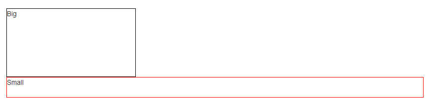
Let’s kick this extra space!!
<div class="row">
    <div class="col-xs-6 col-md-4 col-lg-2 vcenter">
        <div style="height:10em;border:1px solid #000">Big</div>
    </div><!--
    --><div class="col-xs-6 col-md-8 col-lg-10 vcenter">
        <div style="height:3em;border:1px solid #F00">Small</div>
    </div>
</div>
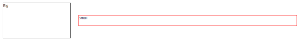
Notice the seemingly useless comments <!-- ... -->? They are important — without them, the whitespace between the <div> elements will take up space in the layout, breaking the grid system.
Note: the Bootply has been updated
Related Posts:
- What is sr-only in Bootstrap 3?
- Bootstrap throws Uncaught Error: Bootstrap’s JavaScript requires jQuery
- How to change the background-color of jumbrotron?
- Bootstrap 3 Glyphicons CDN
- How to make Bootstrap Panel body with fixed height
- Bootstrap 4 images thumbnail classes
- How to center content in a Bootstrap column?
- How to give spacing between buttons using bootstrap
- How can I override Bootstrap CSS styles?
- vertical divider between two columns in bootstrap
- Table fixed header and scrollable body
- how to do a line break in Bootstrap 3.3.7
- How to increase height of textarea using bootstrap rows and columns
- Bootstrap Columns Not Working
- How can I change the Bootstrap default font family using font from Google?
- Change hover color on a button with Bootstrap customization
- Set textarea width to 100% in bootstrap modal
- Creating Accordion Table with Bootstrap
- Change navbar text color Bootstrap
- Open source social media icons to download and use on website? [closed]
- How to make a monopoly board using css grid?
- Half circle with CSS (border, outline only)
- CSS calc width and height values
- What is the difference among col-lg-*, col-md-* and col-sm-* in Bootstrap?
- How to horizontally center an element
- Center image using text-align center?
- Unblur content inside blurring background div
- Failed to load resource: the server responded with a status of 404 (Not Found) css
- See answer keys in Google Form (quiz) source page?
- CSS Background Opacity [duplicate]
- CSS Background Opacity [duplicate]
- How do I vertically align text in a div?
- Hide scroll bar, but while still being able to scroll
- CSS background-image-opacity?
- Resize image proportionally with CSS?
- Setting table column width
- How do I vertically align text in a div?
- How to set a border for an HTML div tag
- How can I center text (horizontally and vertically) inside a div block?
- Embed image in a
- Setting table column width
- Why does z-index not work?
- How do I vertically center text with CSS?
- What is difference between png8 and png24
- Center image horizontally within a div
- Draw Circle using css alone [duplicate]
- Failed to load resource: the server responded with a status of 404 (Not Found) css
- Why does z-index not work?
- How do I vertically center text with CSS?
- How to center an iframe horizontally?
- Can I have an onclick effect in CSS?
- How to style a checkbox using CSS
- Remove CSS class from element with JavaScript (no jQuery) [duplicate]
- Transparent CSS background color
- Creating a nav bar with flexbox
- Set cookie and get cookie with JavaScript
- Prevent line-break of span element
- Is there any way to change input type=”date” format?
- How to align iframe always in the center
- Is
element block level or inline level?
- How to center a “position: absolute” element
- How to line-break from css, without using
? - How to put img inline with text
- How do I auto-resize an image to fit a ‘div’ container?
- Expected RBRACE, but the bracket is there?
- How to make an image center (vertically & horizontally) inside a bigger div
- How to center a “position: absolute” element
- How to center text with Markdown?
- CSS Background Image Not Displaying
- How do I make an image smaller with CSS?
- Set the table column width constant regardless of the amount of text in its cells?
- CSS `height: calc(100vh);` Vs `height: 100vh;`
- Bootstrap Dropdown menu is not working
- Two divs side by side – Fluid display
- CSS Display an Image Resized and Cropped
- How to place a text next to the picture?
- Disable Scrolling on Body
- CSS: Moving the text down a few pixels but keeping the background still?
- Darken CSS background image?
- How do I make a placeholder for a ‘select’ box?
- How to change btn color in Bootstrap
- FontAwesome icons are not showing, Why?
- Fix footer to bottom of page
- CSS no text wrap
- Responsive image map
- Remove border from IFrame
- CSS color vs. background-color vs. background?
- How to position text over an image in css
- How to change text transparency in HTML/CSS?
- CSS horizontal scroll
- shifting a piece of text down using CSS
- How does the data-toggle attribute work? (What’s its API?)
- How to wrap text around an image using HTML/CSS
- Display Two