I would suggest not to use seaborn pointplot for plotting. This makes things unnecessarily complicated.
Instead use matplotlib plot_date. This allows to set labels to the plots and have them automatically put into a legend with ax.legend().
import matplotlib.pyplot as plt
import pandas as pd
import seaborn as sns
import numpy as np
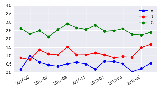
date = pd.date_range("2017-03", freq="M", periods=15)
count = np.random.rand(15,4)
df1 = pd.DataFrame({"date":date, "count" : count[:,0]})
df2 = pd.DataFrame({"date":date, "count" : count[:,1]+0.7})
df3 = pd.DataFrame({"date":date, "count" : count[:,2]+2})
f, ax = plt.subplots(1, 1)
x_col='date'
y_col = 'count'
ax.plot_date(df1.date, df1["count"], color="blue", label="A", linestyle="-")
ax.plot_date(df2.date, df2["count"], color="red", label="B", linestyle="-")
ax.plot_date(df3.date, df3["count"], color="green", label="C", linestyle="-")
ax.legend()
plt.gcf().autofmt_xdate()
plt.show()
In case one is still interested in obtaining the legend for pointplots, here a way to go:
sns.pointplot(ax=ax,x=x_col,y=y_col,data=df1,color='blue')
sns.pointplot(ax=ax,x=x_col,y=y_col,data=df2,color='green')
sns.pointplot(ax=ax,x=x_col,y=y_col,data=df3,color='red')

ax.legend(handles=ax.lines[::len(df1)+1], labels=["A","B","C"])

ax.set_xticklabels([t.get_text().split("T")[0] for t in ax.get_xticklabels()])
plt.gcf().autofmt_xdate()

plt.show()