[Note: edited to modernize ggplot syntax]
Your example is not reproducible since there is no ex1221new (there is an ex1221 in Sleuth2, so I guess that is what you meant). Also, you don’t need (and shouldn’t) pull columns out to send to ggplot. One advantage is that ggplot works with data.frames directly.
You can set the labels with xlab() and ylab(), or make it part of the scale_*.* call.
library("Sleuth2")
library("ggplot2")
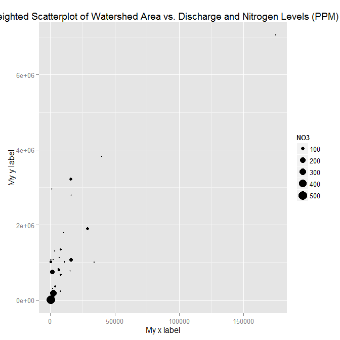
ggplot(ex1221, aes(Discharge, Area)) +
geom_point(aes(size=NO3)) +
scale_size_area() +
xlab("My x label") +
ylab("My y label") +
ggtitle("Weighted Scatterplot of Watershed Area vs. Discharge and Nitrogen Levels
ggplot(ex1221, aes(Discharge, Area)) +
  geom_point(aes(size=NO3)) +
  scale_size_area("Nitrogen") +
  scale_x_continuous("My x label") +
  scale_y_continuous("My y label") +
  ggtitle("Weighted Scatterplot of Watershed Area vs. Discharge and Nitrogen Levels (PPM)")
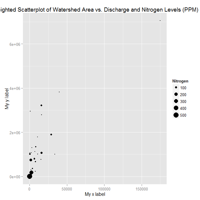
An alternate way to specify just labels (handy if you are not changing any other aspects of the scales) is using the labs function
ggplot(ex1221, aes(Discharge, Area)) +
  geom_point(aes(size=NO3)) +
  scale_size_area() +
  labs(size= "Nitrogen",
       x = "My x label",
       y = "My y label",
       title = "Weighted Scatterplot of Watershed Area vs. Discharge and Nitrogen Levels (PPM)")
which gives an identical figure to the one above.