I want to create a monopoly board like
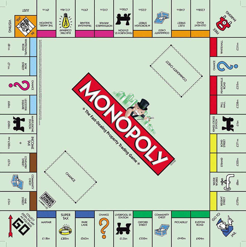
. There are following features in the board
- The corner are square shaped and bigger than other boxes
- The text of each row is facing a specfic angle.
My basic html structure is below
- Board
- Row 1
- Tile 1
- Tile 2 …
- Row 1
I am successful in creating the basic structure using grid-template-areas. The problem I am facing is that I can’t rotate the tiles of each row according to the need.
I have created a basic snippet which have only 3 tiles per row. The first row is facing right angle all other rows are at wrong angle. 90deg for second row. 180deg for third row. and 270deg for fourth row.
I have tried using writing-mode and transform:rotate() but it doesn’t work or maybe I am using it wrong way. Please help me to find the correct way. I will be really thankful
*{
  box-sizing: border-box;
}
#board {
   display: grid;
   /*first and last row and column are bigger than others*/
   grid-template-columns: 100px repeat(2, 70px) 100px;
   grid-template-rows: 100px repeat(2, 70px) 100px;

   /*a, b, c, d are 4 rows and o is center*/
   grid-template-areas:
      "c c c d"
      "b o o d"
      "b o o d"
      "b a a a";
}
#center {
   grid-area: o;
}
.row {
   display: flex;
}
.tile {
   display: flex;
   flex-direction: column;
   border: 1px solid;
   height: 100%;
   width: 100%;
}
.tile-color {
   flex: 3;
   background: red;
   border: 1px solid;
}
.tile-name {
   flex: 6;
}
.tile-price {
   flex: 3;
}

/*Flex directions are used to give the tiles correct order*/
#row-0 {
   grid-area: a;
   flex-direction: row-reverse;
}
#row-1 {
   grid-area: b;
   flex-direction: column-reverse;
}
#row-2 {
   grid-area: c;
   flex-direction: row;
}
#row-3 {
   grid-area: d;
   flex-direction: column;
}

/*To make the corner tiles bigger and square*/
.row > .tile:nth-child(1){
  flex: 0 0 100px;
}
<div id="board">
   <div id="center"></div>

   <!--Row 1-->
   <div class="row" id="row-0">
      <div class="tile">
         <div class="tile-name">Go</div>
      </div>
      <div class="tile">
         <div class="tile-color"></div>
         <div class="tile-name">Tile 1</div>
         <div class="tile-price">Price 1</div>
      </div>
      <div class="tile">
         <div class="tile-color"></div>
         <div class="tile-name">Tile 2</div>
         <div class="tile-price">Price 2</div>
      </div>
   </div>

   <!--Row 2-->
   <div class="row" id="row-1">
      <div class="tile">
         <div class="tile-name">Just visiting</div>
      </div>
      <div class="tile">
         <div class="tile-color"></div>
         <div class="tile-name">Tile 3</div>
         <div class="tile-price">Price 3</div>
      </div>
      <div class="tile">
         <div class="tile-color"></div>
         <div class="tile-name">Tile 4</div>
         <div class="tile-price">Price 4</div>
      </div>
   </div>
 <!--Row 3-->
   <div class="row" id="row-2">
      <div class="tile">
         <div class="tile-name">Free Parking</div>
      </div>
      <div class="tile">
         <div class="tile-color"></div>
         <div class="tile-name">Tile 4</div>
         <div class="tile-price">Price 4</div>
      </div>
      <div class="tile">
         <div class="tile-color"></div>
         <div class="tile-name">Tile 5</div>
         <div class="tile-price">Price 5</div>
      </div>
   </div>

   <!--Row 4-->
   <div class="row" id="row-3">
      <div class="tile">
         <div class="tile-name">Jail</div>
      </div>
      <div class="tile">
         <div class="tile-color"></div>
         <div class="tile-name">Tile 6</div>
         <div class="tile-price">Price 6</div>
      </div>
      <div class="tile">
         <div class="tile-color"></div>
         <div class="tile-name">Tile 7</div>
         <div class="tile-price">Price 7</div>
      </div>
   </div>
</div>
Related Posts:
- Open source social media icons to download and use on website? [closed]
- Half circle with CSS (border, outline only)
- CSS calc width and height values
- How to horizontally center an element
- Center image using text-align center?
- Unblur content inside blurring background div
- Failed to load resource: the server responded with a status of 404 (Not Found) css
- See answer keys in Google Form (quiz) source page?
- CSS Background Opacity [duplicate]
- CSS Background Opacity [duplicate]
- How do I vertically align text in a div?
- Hide scroll bar, but while still being able to scroll
- CSS background-image-opacity?
- Resize image proportionally with CSS?
- Setting table column width
- How do I vertically align text in a div?
- How to set a border for an HTML div tag
- How can I center text (horizontally and vertically) inside a div block?
- Embed image in a
- Setting table column width
- Why does z-index not work?
- How do I vertically center text with CSS?
- What is difference between png8 and png24
- Center image horizontally within a div
- Draw Circle using css alone [duplicate]
- Failed to load resource: the server responded with a status of 404 (Not Found) css
- Why does z-index not work?
- How do I vertically center text with CSS?
- How to center an iframe horizontally?
- Can I have an onclick effect in CSS?
- How to style a checkbox using CSS
- Remove CSS class from element with JavaScript (no jQuery) [duplicate]
- Transparent CSS background color
- Creating a nav bar with flexbox
- Set cookie and get cookie with JavaScript
- Prevent line-break of span element
- Is there any way to change input type=”date” format?
- How to align iframe always in the center
- Is
element block level or inline level?
- How to center a “position: absolute” element
- How to line-break from css, without using
? - How to put img inline with text
- How do I auto-resize an image to fit a ‘div’ container?
- Expected RBRACE, but the bracket is there?
- How to make an image center (vertically & horizontally) inside a bigger div
- How to center a “position: absolute” element
- How to center text with Markdown?
- CSS Background Image Not Displaying
- How do I make an image smaller with CSS?
- Set the table column width constant regardless of the amount of text in its cells?
- CSS `height: calc(100vh);` Vs `height: 100vh;`
- Two divs side by side – Fluid display
- CSS Display an Image Resized and Cropped
- What is sr-only in Bootstrap 3?
- How to place a text next to the picture?
- Disable Scrolling on Body
- CSS: Moving the text down a few pixels but keeping the background still?
- Darken CSS background image?
- How do I make a placeholder for a ‘select’ box?
- FontAwesome icons are not showing, Why?
- Fix footer to bottom of page
- CSS no text wrap
- Responsive image map
- Remove border from IFrame
- CSS color vs. background-color vs. background?
- How to position text over an image in css
- How to change text transparency in HTML/CSS?
- CSS horizontal scroll
- shifting a piece of text down using CSS
- How to wrap text around an image using HTML/CSS
- Display Two s Side-by-Side
- Add border-bottom to table row
- Bootstrap 4 Sticky Footer Not Sticking
- Getting “Failed to load resource: net::ERR_FILE_NOT_FOUND” when trying to load a background image
- CSS: background-color only inside the margin
- Stretch background image css?
- Set cellpadding and cellspacing in CSS?
- How to change css property using javascript
- Center form submit buttons HTML / CSS
- How to make a whole ‘div’ clickable in html and css without JavaScript?
- How (and why) to use display: table-cell (CSS)
- Vertical Text Direction
- Bootstrap 4 images thumbnail classes
- Disable Scrolling on Body
- How do I set a background-color for the width of text, not the width of the entire element, using CSS?
- CSS Background Image Not Displaying
- How to darken a CSS background image?
- Changing image sizes proportionally using CSS
- AngularJS ngClass conditional
- CSS: Moving the text down a few pixels but keeping the background still?
- How can I create a marquee effect?
- How to darken a background using CSS?
- How to use css first-child with :not()
- How to give the background-image path in CSS?
- How can I make a CSS glass/blur effect work for an overlay?
- How to overlay image with color in CSS?
- CSS Background image not loading
- Outline radius?
- How to “crop” a rectangular image into a square with CSS?
- text-overflow: ellipsis not working
- Add border-bottom to table row