the interface remains unchanged, as if no image had been selected. How
do I make the image I have selected appear in the editor?
It remains unchanged because we actually need to manually add a preview of the image, just like the core Image block does, and you can check the source on GitHub, but basically, you could just add a simple <img> tag above, below or even inside the MediaPlaceholder element/area.
And here’s an example for the 3rd option, where we need to pass a React component to MediaPlaceholder via the mediaPreview property:
const mediaPreview = !! attributes.imageUrl && (
    <img src={ attributes.imageUrl } />
);

return (
    <div { ...useBlockProps() }>
        <MediaPlaceholder
            ... your other props
            mediaPreview={ mediaPreview }
        />
    </div>
);
Or for images uploaded to the media library, if you want, you can instead display a thumbnail of the image like so, which uses useSelect and getMedia to fetch the image details (from the REST API), and then I’m displaying the medium-sized thumbnail image:
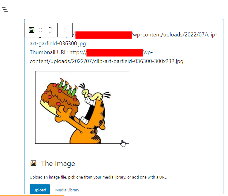
Preview (WordPress v6.0.1):
-
Load
useSelect, e.g. add at the top in your file:import { useSelect } from '@wordpress/data'; -
Replace the
const mediaPreview = ...part with:const { imageUrl, imageId, imageAlt } = attributes; const thumbnailUrl = useSelect( select => { const image = imageId && select( 'core' ).getMedia( imageId ); return image && image?.media_details?.sizes?.medium?.source_url || imageUrl; }, [ imageId ] ); const mediaPreview = !! thumbnailUrl && ( <p> Image URL: { imageUrl }<br /> Thumbnail URL: { thumbnailUrl }<br /> <a href={ imageUrl } title={ imageAlt }> <img src={ thumbnailUrl } /> </a> </p> );Note: The above
[ imageId ]means if the attachment/image ID is changed (e.g. a new image was selected from the media library), then thethumbnailUrl‘s value will also change. Also, if a medium-sized thumbnail isn’t available, then I’m displaying the full-sized image, i.e.imageUrl.
Additional Notes
-
I’d pass a
valuetoMediaPlaceholderso that the selected image will be pre-selected in the media modal. E.g.<MediaPlaceholder ... your other props value={ { // pass an object! id: attributes.imageId, } } /> -
You can use a single
importdeclaration to import multiple “module exports” from a module. For example, this imports 3 exports (a hook and 2 components) from the @wordpress/block-editor package:import { useBlockProps, MediaPlaceholder, BlockIcon, } from '@wordpress/block-editor'; -
For elements with no content (or no inner text), you can just use the self-closing format like
<MediaPlaceholder ... />and no need for<MediaPlaceholder ...></MediaPlaceholder>.You know, just like the
imgtag where we don’t use<img ...></img>.. 🙂 And thus if you noticed it, my examples actually used that self-closing format.