It is Safari specific, at least at time of writing, being introduced in Safari 9.0. From the “What’s new in Safari?” documentation for Safari 9.0:
Viewport Changes
Viewport meta tags using "width=device-width" cause the page to scale down to fit content that overflows the viewport bounds. You can override this behavior by adding "shrink-to-fit=no" to your meta tag as shown below. The added value will prevent the page from scaling to fit the viewport.
<meta name="viewport" content="width=device-width, initial-scale=1.0, shrink-to-fit=no">
In short, adding this to the viewport meta tag restores pre-Safari 9.0 behaviour.
Example
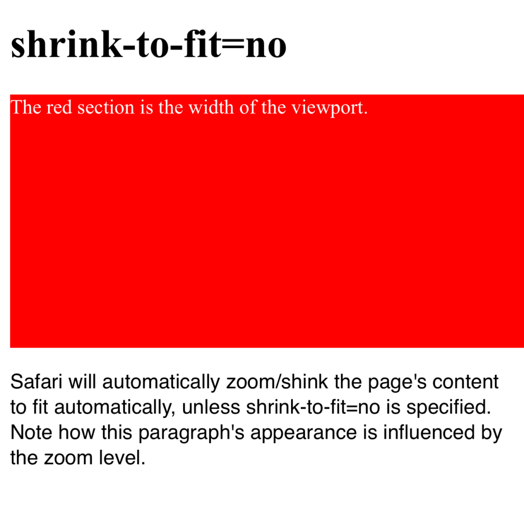
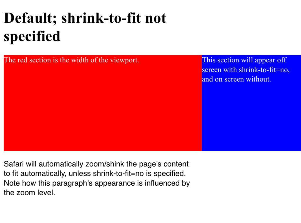
Here’s a worked visual example which shows the difference upon loading the page in the two configurations.
The red section is the width of the viewport and the blue section is positioned outside the initial viewport (eg left: 100vw). Note how in the first example the page is zoomed to fit when shrink-to-fit=no is omitted (thus showing the out-of-viewport content) and the blue content remains off screen in the latter example.
The code for this example can be found at https://codepen.io/davidjb/pen/ENGqpv.
Without shrink-to-fit specified
With shrink-to-fit=no