You should group your blocks inside a container block that lets you choose its background color.
I’m going to give you a couple of options, ordered by accessibility.
Grouped Blocks
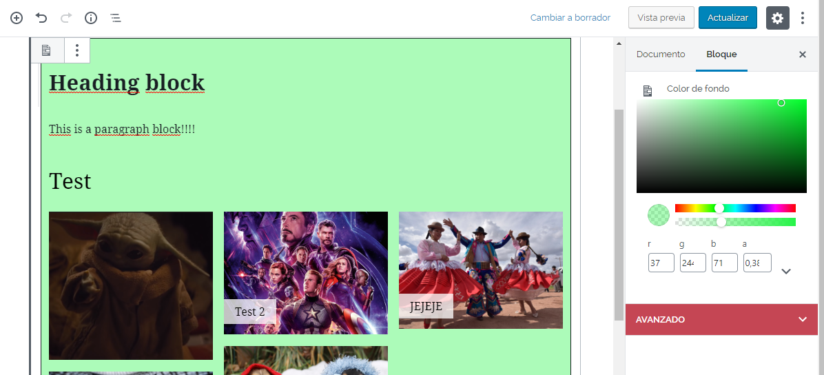
For WordPress 5.3+, there is the Group block that lets you group blocks and select a background color. Check Toms answer for some screenshots.
Cover Blocks
WordPress doesn’t have a background color block, but it does have a block called Cover, from which you can choose a background image and a background color overlay. The overlay can have 100% opacity, hiding the background image and showing only the color as the background. The problem with this block is that it only lets you use paragraphs and headings inside.
Plugins
You could install a custom block that does what you are searching for. There is a plugin that adds a background block that works as a container. It’s called WP Munich Blocks – Gutenberg Blocks for WordPress.
Building Your Own Block
If the previous options don’t make you happy, you could create a block yourself.
You can use Create Gutenberg Block, a developer toolkit that facilitates blocks creation. It may seem a little complicated, but there might be people out there looking for this kind of solution.
This would be a way of doing it. Keep in mind that is a very simple example, but I think that it works pretty well in the editor. You would need to edit the front end look as you like, from CSS to layout.
    const { __ } = wp.i18n; // Import __() from wp.i18n
    const { registerBlockType } = wp.blocks; // Import registerBlockType() from wp.blocks
    const { InspectorControls, InnerBlocks  } = wp.editor;
    const { ColorPicker } = wp.components;

    registerBlockType( 'special/background-color', {
        // Block name. Block names must be string that contains a namespace prefix. Example: my-plugin/my-custom-block.
        title: __( 'Background Color' ), // Block title.
        icon: 'media-document', // Block icon from Dashicons → https://developer.wordpress.org/resource/dashicons/.
        category: 'common', // Block category — Group blocks together based on common traits E.g. common, formatting, layout widgets, embed.
        keywords: [
            __( 'Background' ),
            __( 'Color' ),
            __( 'Container' ),
        ],
        attributes: {
            color: {
                type: 'string',
                source: 'attribute',
                attribute: 'style',
            },
        },
        // The "edit" property must be a valid function.
        edit: function( props ) {
            const { attributes, setAttributes, className, isSelected } = props;

            const style = {
                backgroundColor: attributes.color,
                border: 'solid 1px',
                padding: '10px',
            };

            return (
                <div style={style} className={className + ' background-color-container-block'}>
                    <InnerBlocks />
                    <InspectorControls>
                        <ColorPicker
                        color={ attributes.color }
                        onChangeComplete={ ( value ) => setAttributes( {color: value.hex} ) }
                        />
                    </InspectorControls>
                </div>
            );
        },
        // The "save" property must be specified and must be a valid function.
        save: function( { attributes } ) {
            const style = {
                backgroundColor: attributes.color,
            };

            return (
                <div style={style} className={'background-color-container-block'}>
                    <InnerBlocks.Content />
                </div>
            );
        },
    } );
This is going to be a barebones explanation of what’s going on here. If you need more information, you can always check out the official gutenberg block development documentation.
What we are doing here is registering a block of id special/background-color and name Background Color (you can change those if you want to).
In attributes, we define the data this block works with, and that get saved with the content of the post. In this case we only use the attribute color, that stores the background color for the container.
The edit function controls how the block works on the editor. In this case, we set a container with a background-color that changes with the color attribute. The color is manipulated using the ColorPicker component. When the color changes, we update the view storing the new value using setAttributes. `
The InnerBlocks component is the one that lets us have nested blocks inside the container.
The save function saves the content and controls how the block looks on the front end. Here we only render a div with a background-color equal to the color saved in the attributes. Inside of it, we render the nested blocks using InnerBlocks.Content