You can use pyplot.matshow() from matplotlib:
import matplotlib.pyplot as plt

plt.matshow(dataframe.corr())
plt.show()
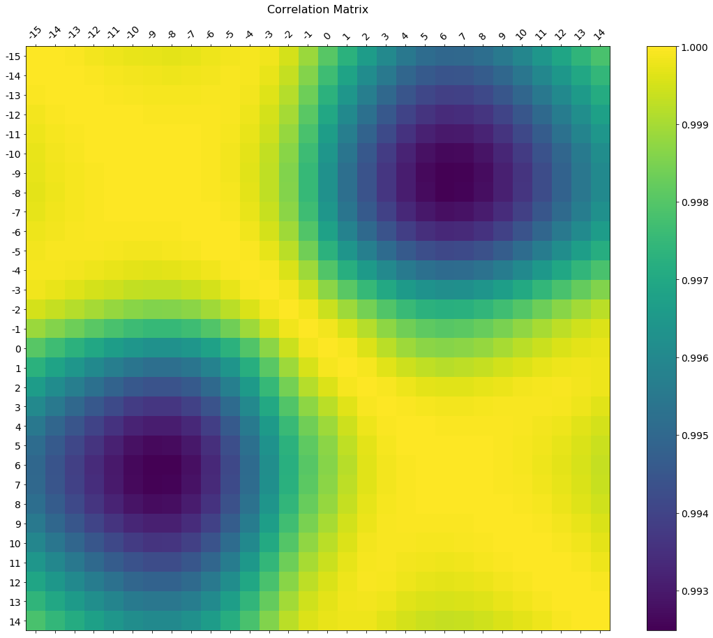
Edit:
In the comments was a request for how to change the axis tick labels. Here’s a deluxe version that is drawn on a bigger figure size, has axis labels to match the dataframe, and a colorbar legend to interpret the color scale.
I’m including how to adjust the size and rotation of the labels, and I’m using a figure ratio that makes the colorbar and the main figure come out the same height.
EDIT 2: As the df.corr() method ignores non-numerical columns, .select_dtypes(['number']) should be used when defining the x and y labels to avoid an unwanted shift of the labels (included in the code below).
f = plt.figure(figsize=(19, 15))
plt.matshow(df.corr(), fignum=f.number)
plt.xticks(range(df.select_dtypes(['number']).shape[1]), df.select_dtypes(['number']).columns, fontsize=14, rotation=45)
plt.yticks(range(df.select_dtypes(['number']).shape[1]), df.select_dtypes(['number']).columns, fontsize=14)
cb = plt.colorbar()
cb.ax.tick_params(labelsize=14)
plt.title('Correlation Matrix', fontsize=16);