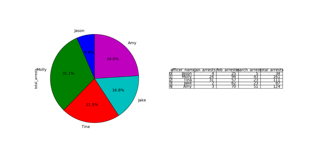
Look at the code:
import pandas as pd
import matplotlib.pyplot as plt
from pandas.tools.plotting import table

# sample data
raw_data = {'officer_name': ['Jason', 'Molly', 'Tina', 'Jake', 'Amy'],
        'jan_arrests': [4, 24, 31, 2, 3],
        'feb_arrests': [25, 94, 57, 62, 70],
        'march_arrests': [5, 43, 23, 23, 51]}
df = pd.DataFrame(raw_data, columns = ['officer_name', 'jan_arrests', 'feb_arrests', 'march_arrests'])
df['total_arrests'] = df['jan_arrests'] + df['feb_arrests'] + df['march_arrests']

plt.figure(figsize=(16,8))
# plot chart
ax1 = plt.subplot(121, aspect='equal')
df.plot(kind='pie', y = 'total_arrests', ax=ax1, autopct='%1.1f%%',
 startangle=90, shadow=False, labels=df['officer_name'], legend = False, fontsize=14)

# plot table
ax2 = plt.subplot(122)
plt.axis('off')
tbl = table(ax2, df, loc='center')
tbl.auto_set_font_size(False)
tbl.set_fontsize(14)
plt.show()