<div class="row">
    <div class="col-xs-12 col-sm-5">
        <img class="img-responsive" src="{{$blogPost->getImagePath()}}" width="100%">
    </div>
    <div class="col-xs-12 col-sm-7">
        <div class="row">
            <div class="col-sm-6">
                <h2>{!!$blogPost->title!!}</h2>
            </div>
            <div class="col-sm-6">
                <h3 class="pull-right">
                    {{$blogPost->created_at}}
                </h3>
            </div>
        </div>
    </div>
    {!! Purifier::clean($blogPost->message) !!}
    <div class="col-xs-12">
        <hr />
    </div>
</div>
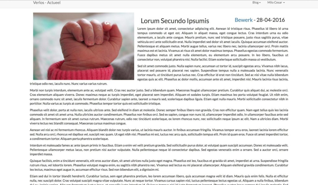
Wrapping the title and created at date in a new column to compliment the width of the image and setting all the other text outside any column did the trick for me.
A small downside is that the margins don’t line up but I am sure I’ll find a fix for that using some custom CSS.

