The following code generates a spectrogram using either scipy.signal.spectrogram or matplotlib.pyplot.specgram.
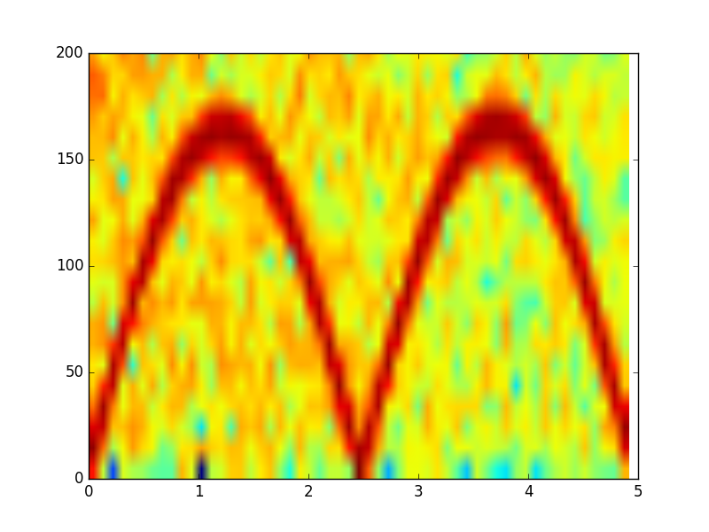
The color contrast of the specgram function is, however, rather low. Is there a way to increase it?
import numpy as np
from scipy import signal
import matplotlib.pyplot as plt

# Generate data
fs = 10e3
N = 5e4
amp = 4 * np.sqrt(2)
noise_power = 0.01 * fs / 2
time = np.arange(N) / float(fs)
mod = 800*np.cos(2*np.pi*0.2*time)
carrier = amp * np.sin(2*np.pi*time + mod)
noise = np.random.normal(scale=np.sqrt(noise_power), size=time.shape)
noise *= np.exp(-time/5)
x = carrier + noise
Using matplotlib.pyplot.specgram gives the following result:
Pxx, freqs, bins, im = plt.specgram(x, NFFT=1028, Fs=fs)
x1, x2, y1, y2 = plt.axis()
plt.axis((x1, x2, 0, 200))
plt.show()
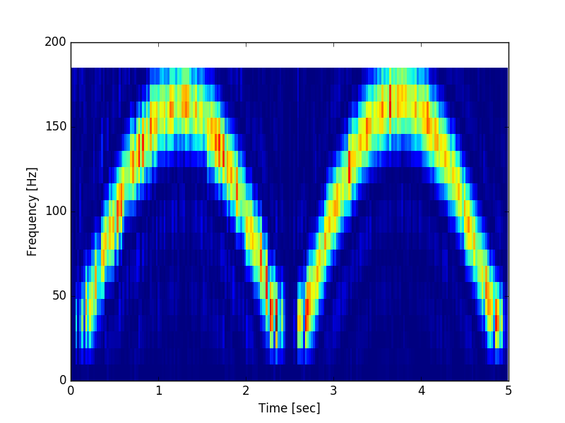
Using scipy.signal.spectrogram gives the following plot
f, t, Sxx = signal.spectrogram(x, fs, nfft=1028)
plt.pcolormesh(t, f[0:20], Sxx[0:20])
plt.ylabel('Frequency [Hz]')
plt.xlabel('Time [sec]')
plt.show()
Both functions seem to use the ‘jet’ colormap.
I would also be generally interested in the difference between the two functions. Although they do something similar, they are obviously not identical.